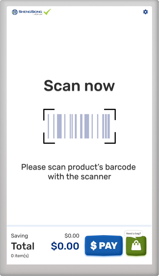
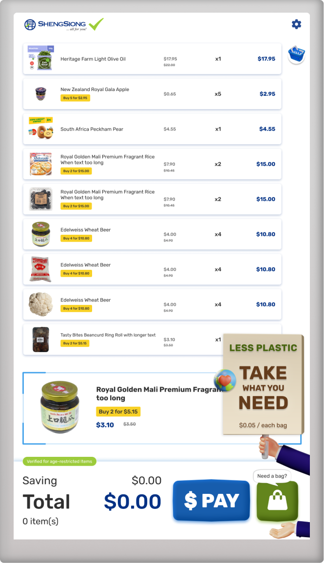
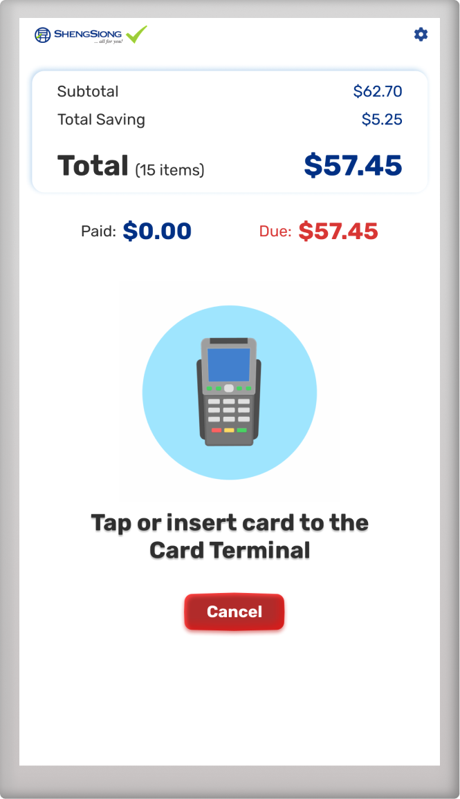
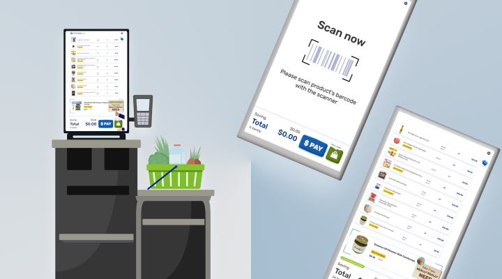
A self-checkout kiosk to assist user to purchase goods and services without the assistance of a staff member.
G2i Kiosk is the first self-checkout kiosk in Singapore that has implemented shopping bag rollout feature. It is designed in easy use way for wide range of users includes customers and admin staff. It able to reduces customers’ waiting time, while lightening the load of cashiers. The design type is in Claymorphism that consist of 3D graphics with bright and vivid colors. Since WinForm code styling has limited options, most of the buttons and layer layouts is built in image format.
The kiosk came with default UI and the new design is based on the default capability without over tweak it's existing core features.
- Kiosk LocatedSheng Siong outlets
- StackC# / WinForm
- AnimationLottiefiles
- Design StyleClaymorphism by Michal Malewicz
- Flow ChartG2i - Flow Chart
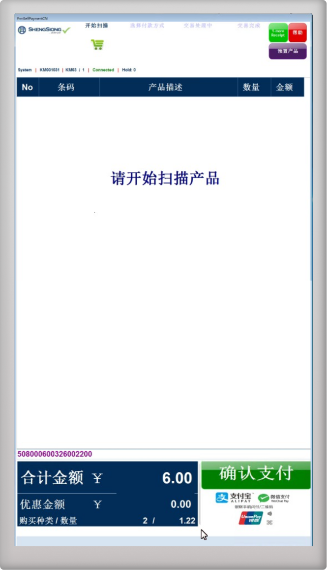
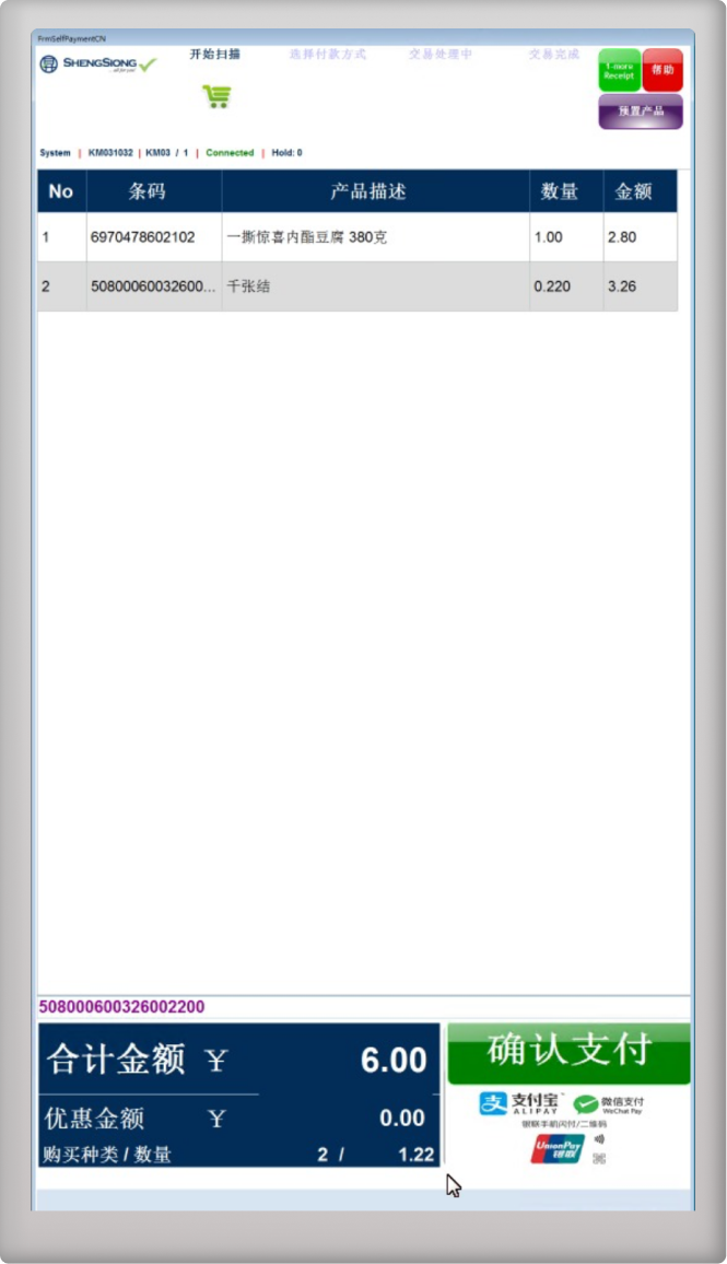
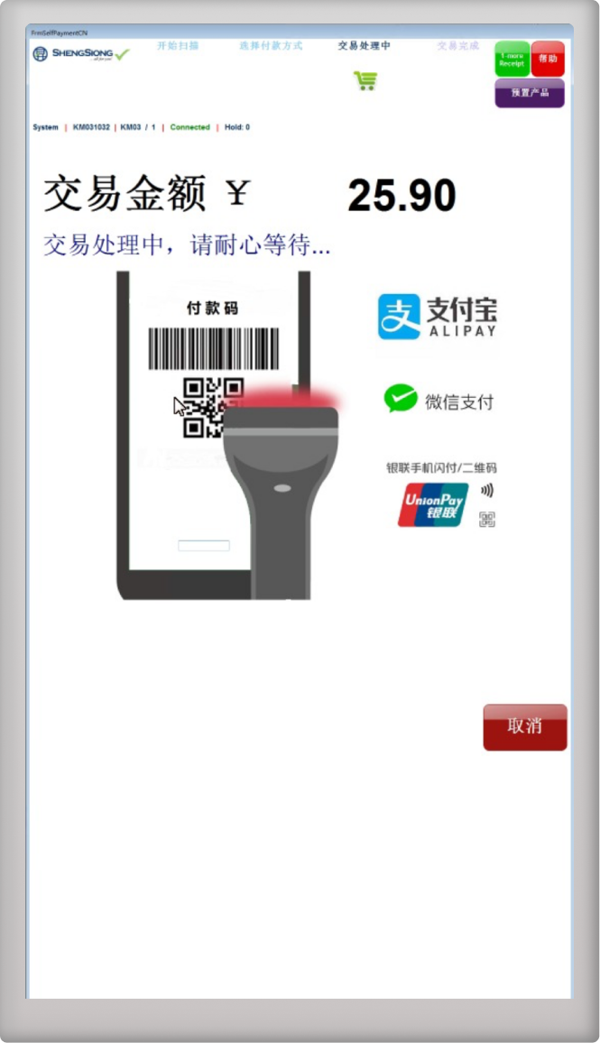
UI PROBLEM (Before)
- Too much buttons in one page included admin staff and customer actions
- Scanned item is label in text, sometimes user is taking longer time to check what they have scanned
- Outdated looking UI
UI SOLUTION (After)
- Reduced buttons show in 1 page, cleaner and clearer button placement
- Scanned item will be showed in image, user able to check what they have scanned easily
- Trendy UI look with 3D illustrations and animations
