Kiosk Interface DesignDesign SystemUI/UX Design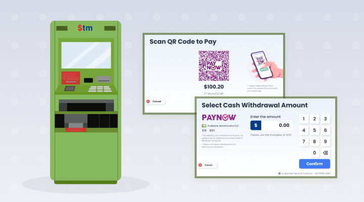


$tm machines are topped-up with cash from supermarkets’ sales, and users can withdraw money using their ATM cards
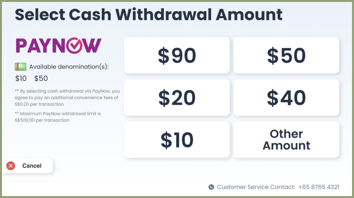
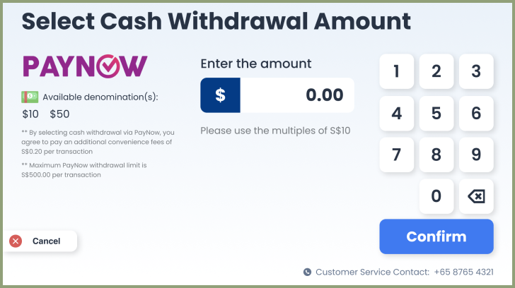
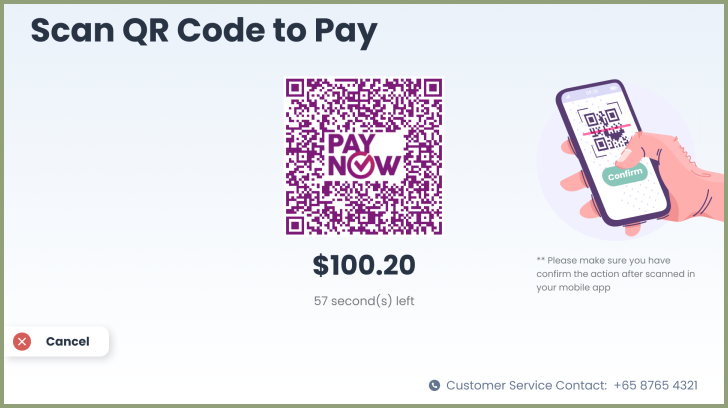
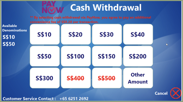
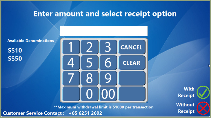
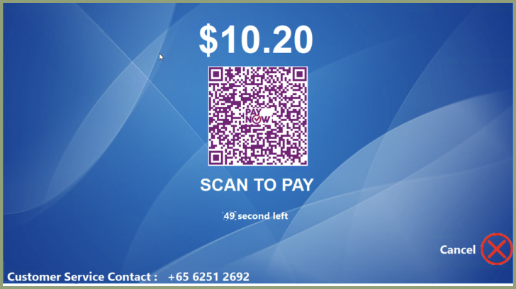
The kiosk application screen is redesigned to improve UI/UX and focus on more user friendly for wide range of users.
- UsageATM Machine
- StackWinForm / C#
- Deisgn ToolsFigma

UI PROBLEM (Before)
- Buttons too oversize and confused instruction
- Lack of simple icon and clear text
- Outdated looking UI


UI SOLUTION (After)
- Proper size button in proportional scale screen
- Included simple icons and clear instructions
- Trendy and clean looking UI
